It’s time to take a look at the next two data points: annual deficits and the total national debt. Let’s start with deficits (the extent to which each year’s spending is in excess of the revenue available). The chart below displays deficits in terms of nominal dollars.
Federal Deficits: Nominal Dollars
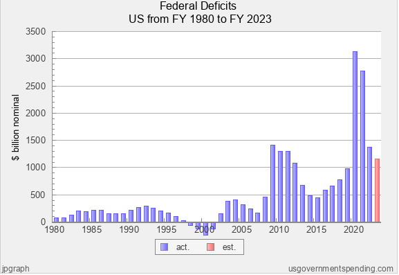
From 1980 to 2008 (about two-thirds of the 43-year period), the deficits seem to be somewhat modest, usually well under $500 billion per year. There are even four years where there were Budget surpluses (1998, 1999, 2000, and 2001). After this long period of somewhat modest deficits, the deficit skyrocketed to $1,413 billion in 2009, and remained over $1,000 billion the next three years (2010, 2011, and 2012), before dropping below $500 billion briefly. The deficit again skyrocketed in 2020 (from $983 billion in 2019 to $3,132 billion in 2020) and remained very high at $2,775 billion in 2021. Finally, deficits began to drop in 2022 and 2023, although they remain over $1,000 billion.
Some thoughts and insights based on the graph above:
The deficit looks relatively modest from 1980-2008: why?
First, we know from our prior analysis that nominal dollar displays don’t display or reflect the impact of inflation, thus distorting the presentation more and more as we go back in time. For instance, if we converted that $74 billion deficit in 1980 to 2012 dollars, it would be $174 billion; and the amount would be far greater in terms of 2023 dollars. Also, what appear to be modest deficits in these early years were actually significant at the time: the $74 billion deficit in 1980 actually constituted about 12.5% of total federal spending for that year.
There are at least two real reasons why deficits were modest in some of the early years, particularly the period of 1995 through 2007. During this period the economy was relatively strong, and thus produced robust tax revenues. Later, when we examine the metric of federal revenue, we’ll be able to determine the extent to which the strong revenues during this period enabled modest deficits and even Budget surpluses. Another reason is attributable to control of government. In the 1994 midterms, President Clinton and the Democrats lost control of both houses of Congress, which continued to the end of Clinton’s term in 2001. Republicans had the ability to control spending and they exercised it by approving modest increases in spending while eliminating or limiting annual deficits. Then, in the November 2000 elections, George Bush and the Republicans captured the Presidency and both houses of Congress, and this unified control of government lasted until January of 2007 (the Democrats captured control of both house of Congress in the November 2006 midterms).
The existence of a deficit is “normal,” and ups and downs in the total amount of the deficit are to be expected.
In only four of the 43 years was there not a deficit. In fact, since 1960, there have only been six years where there was a budget surplus. Going back in time, we have had deficits under both Republican and Democrat presidents, under Republican-controlled Congresses, under Democrat-controlled Congresses, and under divided Congresses. As has been pointed out, Republicans have sometimes enjoyed partial success in limiting deficits and controlling spending (1995-2007, and 2011-16). Most of the time, however, the country has a serious mismatch between what it spends and what it takes in; and most of the time both sides have accepted and tolerated deficits as part of the status quo.
There are also noticeable ups and downs in annual deficits, and, given our prior analysis of spending, this makes sense. We know from that analysis that the US experienced a serious recession in 2009, and there was huge spending for stimulus packages. We also know that in connection with the worldwide Covid-19 pandemic and recession of 2020, there were also huge increases in federal spending in 2020 and 2021. Clearly, the compelling need to address these extraordinary conditions required the federal government to spend far more than the revenue available. Also, since the spending increases were temporary, rather than permanent, deficits tended to go down when the extraordinary spending was discontinued. In addition, when we later examine the metric of revenues, we’ll be able to assess the extent to which the weakened and recovering economies during these years produced less tax federal revenue.
If we go further back in time and extend the timeframe for analysis, we can verify that certain events or conditions almost always result in increased federal deficits. Wars are the first such event. World War I and II, as well as the Korean conflict, the war in Vietnam, and the various wars in the middle east have all operated to increase federal deficits due to increased spending for defense. Second, recessions have typically been accompanied by increased deficits due to extraordinary spending for stimulus packages. We clearly see this in 2008-09, and 2020; but the recessions of 2001, 1992, and the early 1980’s also increased deficits. Third are national emergencies or worldwide emergencies such as the September 11, 2001 terrorist attacks and the Covid-19 pandemic. Finally, we can affirm that federal deficits tend to increase during times of high inflation (e.g. 1980-83, and 2021-22).
Federal Deficits: Percentage of GDP
The graph below examines deficits using the metric of percentage of gross domestic product (GDP). As a reminder, gross domestic product is defined as the total value of goods produced and services provided in the US during a given year.
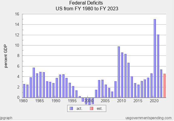
Deficits tend to be in the range of 2-4% of GDP under “ordinary” conditions.
Given our prior analysis, much of what is seen above makes sense. We know that recessions in the early 1980’s drove up spending, moderated GDP growth, and very probably drove down federal revenue (which we’ll examine in an upcoming post). The same is true of the recession occurring in 1991. And we also know that the recession of 2008-09 and the pandemic/recession of 2020 and 2021 had the same effect. Thus, it shouldn’t be surprising to see percentages above 4% of GDP in the early 1980’s and early 1990’s. It’s also understandable that percentages would soar in the range of 7-10% of GDP in connection with the 2009 recession, and to the range of 12-15% with the pandemic/recession of 2020 and 2021. The 2009 recession was the worst recession since the Great Depression, and the 2020 recession/pandemic involved multi-trillion dollar stimulus packages in 2020 and 2021.
Further, the relatively low percentages in the period of the mid-to-late 1990’s and up to 2008 are explained by the relatively strong economy (strong GDP) during this time.
What this graph therefore suggests is that while deficits are still the rule, rather than the exception, under ordinary conditions (times without recessions, wars, national emergencies, etc.), it’s typical for deficits to be in the range of 2-4% of GDP.
Total Federal Debt: Nominal Dollars
Let’s move on to exploring total national debt. Below is the history, using the metric of nominal dollars.
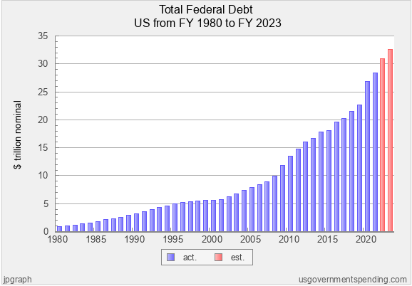
The national debt increased relentlessly and substantially every year, regardless of whether or not the President’s political party controlled both houses of Congress.
What probably jumps out most about this display is the relentless and substantial increase in the total national debt. It goes up every year. In fact, the average annual rate of increase is an eye-popping 8.68%. Clearly there is a bigger jump in 2009, coinciding with the major recession; and there is a visibly bigger jump in 2020, coinciding with the Covid-19 pandemic and the recession. These jumps make sense, given our prior analysis of the effect of recessions and emergencies/pandemics.
If we extend the timeframe of the analysis, we’ll see familiar patterns. Total federal debt tends to increase substantially during times of war, recession, and national or worldwide emergencies (such as Covid-19). The country has had annual deficits almost every year (all but 4), and these deficits accumulate into a huge sum. During this period we’ve had several recessions (1982-82, 1991, 2001, 2008-09, and 2020), at least three wars (Gulf War, Iraq, Afghanistan) and at least two major emergencies (the terrorist attacks of 9-11 and Covid-19). In this context, it’s also worth noting that – unlike most state and local governments – the federal government is not required to establish and maintain a budget reserve to assist in times of extraordinary conditions.
The total federal debt went up during every President’s term, regardless of whether the President’s political party controlled both houses of Congress. Almost always the rate of increase was substantial; and in only one period was the rate of increase somewhat gradual (1995-2001).
Total Federal Debt: Percentage of GDP
Let’s move on to looking at total federal debt using the metric of percentage of GDP in the graph below.
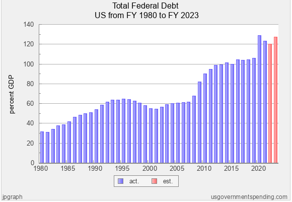
Debt accumulates faster than GDP growth during times of exceptional circumstances (war, etc) and only decreases when the GDP expands/the economy improves.
In the first 11 years (1980-1991), debt as a percent of GDP climbed steadily from about 30% to 60%. Then for about 17 years (1991-2007), the percentage was relatively stable, around 60% of GDP. Then, in connection with the major recession of 2008-09, the percentage jumped quickly to 80% and then to around 100% of GDP by 2011. It stayed at around this level until the Covid-19 pandemic/recession of 2020, when it shot up to 120% or more of GDP.
While we’ve seen that the total federal debt has increased relentlessly in terms of nominal dollars, when we look through the lens of percentage of GDP, we see that for extended periods of time the debt seems to be growing at the same rate that GDP is expanding. However, when exceptional circumstances occur (war, recession, pandemic, emergency, etc.), debt accumulates faster than GDP growth, thus raising the percentage. Getting the percentage back down again appears to be an arduous task. When we go back further in time, this conclusion is validated, especially with respect to such extraordinary conditions as World War I, the Great Recession, and World War II. Thus, only as the economy grows (GDP expands), does the does the percentage come down, provided the country continues to enjoy periods without extraordinary conditions.
Key Takeaway
Spending, deficits, and the national debt appear to be very heavily influenced by extraordinary conditions (war, recession, emergencies, pandemics, etc.). While the political parties have tended to place the entire blame on one another for excessive spending and the out-of-control national debt, it is beginning to appear that extraordinary conditions are the largest factor; and that the parties in control of the Presidency and Congress are a lesser factor. Further, to the extent we cast blame on the political parties and their leaders, both parties (Republicans and Democrats), have presided over huge increases in spending and the unprecedented growth of the national debt.
Next in the Series
EXPLORE THE WHOLE SERIES
Federal Spending and the National Debt

Brinkmanship on the Debt Limit: There’s a Better Way to Gain Control of Federal Spending and the National Debt (1 of 10)

An Objective Framework for Understanding the Problems Related to Federal Spending, Deficits, and the National Debt (Part 2 of 10)

Federal Spending (1980-2023): What Insights Can We Gain? (Part 3 of 10)

Federal Deficits and Total Federal Debt (1980-2023): What Insights Can We Gain? (Part 4 of 10)

US vs. Other Countries: How Do We Compare on Spending, Deficits, and Debt? (Part 5 of 10)

Revenues (1980-2023): What Insights Can We Gain? (Part 6 of 10)

Additional Insights on Federal Spending (Part 7 of 10)

Key Insights Gained From the Analysis of Federal Spending, Deficits, and Debt (Part 8 of 10)

Potential Solutions to Address Federal Spending, Deficits, and Debt: Applying Research and Insights as Opposed to Partisan Dogma (Part 9 of 10)

Leave a Reply