I want to first commend all of you who have persisted through this demanding series: Congratulations! I realize I may have lost some (many?) of you in this maze of information. But if we’re ever going to solve these problems, we have to understand them in a far more sophisticated way than through the lens of divisive partisan rhetoric and simplistic solutions.
Spending Perspectives: Three Additional Data Points or Metrics
Let’s finish the analysis of federal spending using some new data points and metrics:
- First, we’ll compare federal spending increases with increases in spending by STATE AND LOCAL GOVERNMENTS during the same period of time (1980-2023).
- Second, we’ll examine how spending has changed as to the major federal programs (Pensions/Social Security, Healthcare, Defense, etc.).
- Third, we’ll assess federal spending in light of the population growth and inflation that has occurred over the 43 years, thus giving us insight as to the increase in “real spending.”
Federal Spending Compared to State and Local Spending: Nominal Dollars
The graph below shows spending increases (in nominal dollars) for state and local governments during the period of 1980-2023.
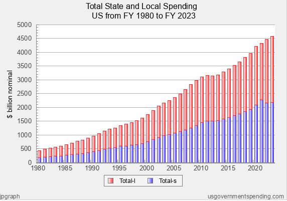
Total state and local spending increase at a greater rate than federal spending.
During the 43-year period, spending for state and local governments increased from $432.33 billion to $4,587.73 billion. This computes to a 961% increase, or an average increase of 5.65% per year. These increases are clearly greater than the increase in federal spending over the same period of time (880% overall, and 5.45% per year, respectively).
State and local governments depend heavily on the federal government to serve the needs of their citizens both in regular times and in extraordinary times (recession, pandemic, natural disasters, and other emergency conditions).
Compared with the year-to-year changes in federal spending, the annual increases in state and local spending appear to be more gradual and consistent. As you’ll recall, federal spending surged in 2009 and 2020 in connection with the great recession of 2009 and the Covid-19 pandemic/recession of 2020 and 2021. On the other hand, state and local government spending appears to steadily increase, except for falling briefly and leveling off in the 2012 and 2013 timeframe.
The consistent and steady increase in spending by state and local governments can be partially attributed to actions of the federal government. First, we know that in connection with the recession of 2009 and the Covid-19 pandemic/recession of 2020 and 2021, the federal government enacted huge stimulus packages that sent major fiscal relief to individuals, private sector entities, and state and local governments. For instance, as to the American Rescue Plan Act of 2021, states received $195.3 billion in Coronavirus Relief Funds and local governments received $130.2 billion. Additional assistance for state and local governments in the stimulus package included $130 billion for schools, $20 billion for public transit systems, and $50 billion for FEMA’s Disaster Relief Fund. State and local governments used these stimulus payments to make up for major revenue losses caused by the recessions and the pandemic. But for the federal stimulus money, state and local governments would have been forced to make major reductions in spending or incur large budget deficits.
Also, these stimulus payments to state and local governments were in addition to regular federal allocations to state and local governments that are made annually in connection with federal programs. According to the Tax Policy Center Briefing Book, in 2018, about 30% of all state government revenues came from intergovernmental transfers from federal government. And, according to the Urban Institute, in 2019, transfers from the federal government provided 22 percent of combined state and local general revenues.
In summary, state and local governments depend heavily on the federal government to serve the needs of their citizens both in regular times and in extraordinary times (recession, pandemic, natural disasters, and other emergency conditions). With ongoing and extraordinary funding provided by the federal government, state and local governments have enjoyed continuity in spending and avoided budget shortfalls and/or deficit spending during extraordinary times.
Federal Spending for Key Programs: 1980-2023
Let’s shift the focus to federal spending for key programs, using the metric of nominal dollars. We’re going to focus on pensions (social security), health care, defense, and interest.
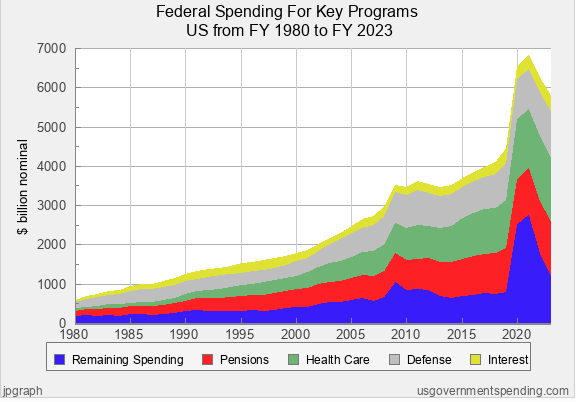
My notes and observations for each section of the graph are as follows:
Remaining Spending
At the base we see Remaining Spending (blue), which is the spending that remained after spending for the four items we selected (Pensions, Health Care, Defense, and Interest). We see Remaining Spending spike up temporarily in 2009 and 2020 and 2021. This spending is attributed to the huge stimulus packages that provided relief funds outside of existing federal programs. Aside from these spikes, Remaining Spending appears to grow modestly over time. To validate, I went back and looked at separate data on Remaining Spending and found that it only increased by 558% over the period (compared with overall spending increasing by 880%). Finally, because spending for our other programs is stacked on top of the Remaining Spending swath, this explains the upward juts for each program during the time spending spiked for Remaining Spending.
Pensions
Pensions (red) appear to grow consistently over time. This makes sense because each year more and more Americans are receiving Social Security/federal pensions, and pensions are being increased with inflation adjustments. To confirm, I went back and looked at separate data on pensions and found spending for pensions increased by 943% over the period.
Health Care
The third swath is spending for Health Care (green). which also appears to be growing in an ever-widening manner. Again, I went back to look at separate data on Health Care and found that spending increased 2,862% during the period. This very significant increase in Health Care spending is mostly explained by the adoption of the Affordable Care Act in 2010.
Defense
Fourth, spending for Defense also appears to steadily increase. When I went back to look at separate data on Defense, I found the increase to be 595% during the period. Thus, spending for Defense has not increased at the rate of overall spending.
Interest
Spending for Interest (yellow) appears to fluctuate, but seems to be ever-present.
Federal Spending for Key Programs: Longer Time Period (1900-2023)
To gain additional insights, I decided to widen the timeframe for analysis (1900-2023) and switch to the metric of percentage of gross domestic product.
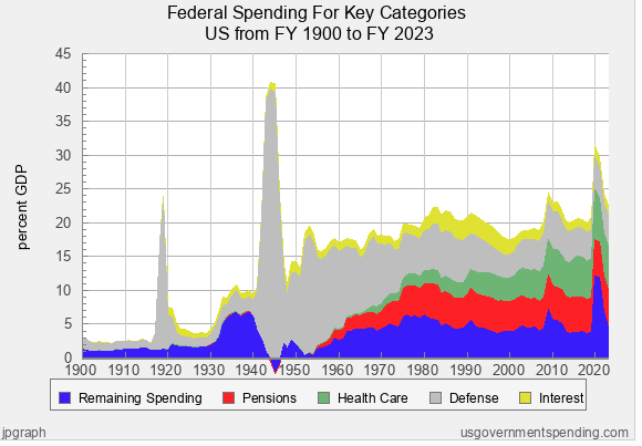
- One of the most obvious insights from this graph is that we see the very dramatic spikes in Defense spending (gray) during times of war (e.g., WW I and WW II). This makes sense, as wars present urgent spending needs over their durations. Clearly, the need to spend on a given Defense can change over time.
- Again, we see spikes or significant jumps in spending for Remaining Spending in the timeframe of the 1930’s, in 2009-10, and in 2020-21. These spikes are explained by the stimulus spending (New Deal Programs) to address the Great Depression that started 1929, the Great Recession of 2009, and the Covid pandemic/recession of 2020 and 2021. To a lesser extent, the spikes in the early 1980’s and in 1991, are also explained by recessions and stimulus spending that occurred during these times. Clearly, recessions and emergencies (pandemics) tend to bring greater spending in this category.
- By applying the metric of percentage of GDP, it’s much more apparent that spending for Pensions (red) and Health Care (green) have increased at greater rates than overall spending. Pensions (Social Security) first emerged in 1935, as part of the New Deal. Also, the first major Health Care program was Medicare, which came about in 1965, as part of the War on Poverty. Again, the Affordable Care Act of 2010 operated to significantly increase federal spending for health care.
- Spending for Interest (yellow) also appears to fluctuate over time. The relatively wide swaths in the 1980’s and 1990’s are mostly explained by high interest rates that were brought on by periods of high inflation.
How Much Spending is Attributable to the Effects of Inflation and Population Growth?
While federal spending in terms of nominal dollars has increased at a huge rate over 43 years, how much of this spending is due to the effects of inflation and population change? After all, there are now 108 million more Americans than there were in 1980 (226.546 million in 1980 vs 334.548 million in 2023), about a 48% increase in population. Also, the costs of goods and services provided by the federal government has increased greatly over the 43 years. To name just a few items, think of increased Social Security payments, increased costs of health care for Medicare recipients, increased costs of military equipment and personnel, and increased costs of providing disaster relief.
To assess the impact of population change and inflation, we’ll be applying the metric of per capita spending in terms of 2012 dollars. We adjust for population change by looking at costs per person. And, the nominal dollar spending for each year is adjusted to indicate what that spending would be if it were converted to dollar values in 2012.
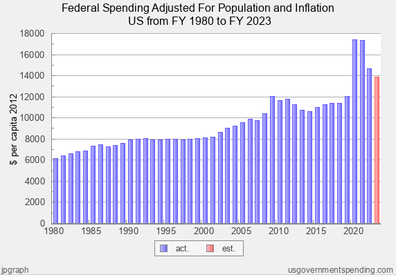
Over the 43-year period, real spending (per capita spending in 2012 dollars) increased 125%, or at a rate of 1.9% per year. This compares with nominal dollars spending which increased 880%, or at an average rate of 5.45% per year. Clearly, most of the increase in federal spending can be attributed to the effects of inflation and population change.
An alternate method to compute the effects of inflation and population change is to use the Consumer Price Index (CPI) as the inflation factor and then adjust for population change by the percentage increase in population from 1980 to 2023. Using the Consumer Price Index (CPI) inflation calculator, $1 in spending in 1980 converts to $3.60 in 2023. Thus, the $590.94 billion in 1980 federal spending converts to $2,127.38 billion in 2023. With the US population increasing by 47.67%, spending would be further adjusted to $3,141.51 billion. Since 2023 spending was $5,792.05 billion, it exceeded the inflation and population adjusted 1980 spending ($3,141.51 billion) by $2,650.54 billion, which computes to an 84.3% increase in real spending since 1980. This equates to a 1.43% increase per year.
Consequently, we can conclude that real spending—as opposed to nominal spending—increased somewhere in the range of 84 to 125% during the 43-year period, with the average annual increase somewhere in the range of 1.43 to 1.9%. While a nominal spending increase of 880% and 5.45% per year might strike one as excessive and out of control; when we look at real spending, an 84-125% overall increase and a 1.4-1.9% annual increase appear to be modest and reasonable.
Next in the Series
We’re about to get to the payoff for this deep and arduous dive. I’ll summarize the major insights we should take away from the analysis, and we’ll start evaluating potential solutions.
EXPLORE THE WHOLE SERIES
Federal Spending and the National Debt

Brinkmanship on the Debt Limit: There’s a Better Way to Gain Control of Federal Spending and the National Debt (1 of 10)

An Objective Framework for Understanding the Problems Related to Federal Spending, Deficits, and the National Debt (Part 2 of 10)

Federal Spending (1980-2023): What Insights Can We Gain? (Part 3 of 10)

Federal Deficits and Total Federal Debt (1980-2023): What Insights Can We Gain? (Part 4 of 10)

US vs. Other Countries: How Do We Compare on Spending, Deficits, and Debt? (Part 5 of 10)
Revenues (1980-2023): What Insights Can We Gain? (Part 6 of 10)

Additional Insights on Federal Spending (Part 7 of 10)

Key Insights Gained From the Analysis of Federal Spending, Deficits, and Debt (Part 8 of 10)

Potential Solutions to Address Federal Spending, Deficits, and Debt: Applying Research and Insights as Opposed to Partisan Dogma (Part 9 of 10)

Leave a Reply